Filled with tired cookie-cutter packaging by brands selling “vegan” substitutes – the plant-based food aisle has seen its share of stereotypes. But one brand is bucking conventions with a rebrand designed to bring people together rather than separate them. Meet La Vie Foods, whose mission “to celebrate life, the thing we all share” served as the guiding light for an identity refresh breaking the mold.

Gone are the all-too-familiar imitation meat brand names and nutritional fact splashes. In their place stands a bright pops of pink, bursts of illustration, and a heart at the center – elements combining to radiate the brand’s spirit of joy, inclusiveness and love for life in all forms. Stepping back from conflict and compromise, La Vie Foods invites both vegans and omnivores to the table with an identity audacious enough to turn heads.
Under a new vision focused not on rules but on our shared humanity, this plant-powered pioneer launched one of the category’s most ambitious and coherent rebrands to date. Now customers may find comfort in the familiar yet be swept away by the refreshingly fun and cheeky aesthetic awaiting them in-store. For La Vie Foods, the reward lies not in box-checking but in bringing people together – and the results are as flavorful as their foods.
The rebranding of La Vie Foods was no small feat. Their aim was to create an entire brand universe, complete with a distinct identity, a playful tone, and packaging that defied the conventional norms of the industry. However, this endeavor presented them with an intriguing challenge: how to strike a delicate balance between conveying product information and upending the established semiotic codes. Thankfully, La Vie possesses the audacity, ambition, and talent to triumph over this challenge.

When crafting the brand identity for La Vie, inspiration flowed from the very core of their strategy: “from plants with love.” Departing from the tired clichés of imitating meat packaging with a vegan twist, La Vie chose a different path—one that tapped into the depths of human emotion and celebrated the vibrant essence of existence itself. No compromises were allowed when it came to colors, styles, typography, and messaging. Every element had to exude the same deep love and unapologetic boldness that fueled their strategy.
One cannot help but be captivated by the striking illustration style that distinguishes La Vie’s brand identity. Their goal was to create a visual language that would leap off the shelves and permeate all touchpoints of the brand. Enter Egle Zvirblyte, an illustrator renowned for her extraordinary work with global giants like Apple, Google, Adidas, Nike, and Volcom. Zvirblyte’s unique style injects warmth, edginess, and humor into the La Vie universe, breathing life into the brand and captivating hearts and minds. The collaboration with Zvirblyte was a testament to La Vie’s unwavering commitment to originality and visual allure.

The logo of La Vie Foods is a compelling embodiment of their love for life and plants. While the use of a heart symbol may not be groundbreaking, its significance lies in its seamless integration with the chosen typography. The delicate balance struck between the heart and other design elements ensures that it feels like an organic extension of the logo, embodying the essence of the brand.
The colors selected for La Vie Foods’ palette are a vibrant celebration of life itself. Dominated by an empowering shade of pink, the palette flirts mischievously with the color of bacon, playfully teasing the senses. Additional splashes of green and red support the dominant hue, providing differentiation among the products. A touch of black adds contrast and a bold edge. Together, these colors create a cohesive aesthetic that elicits smiles and infuses viewers with a contagious surge of energy—much like the food itself.
For designers venturing into similar projects, the success of La Vie’s rebranding offers invaluable lessons. Collaboration with clients is key, as it fosters a dynamic exchange of ideas and mutual inspiration. Furthermore, a strong and intelligible yet subtly nuanced concept serves as the creative springboard for all design endeavors. Lastly, seeking out and connecting with inspirational figures, such as the collaboration with Egle Zvirblyte, ensures that the brand’s integrity and energy remain untainted throughout the creative process.
Read more:
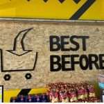
- Best Before Opens New Centurion Store, Challenging Pick n Pay and Checkers with Low Prices

- Local Shops Outpaced Supermarkets as Consumers Flocked to Spazas and Taverns
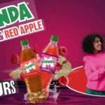
- Mirinda Welcomes Red Apple and Raspberry to the Family
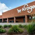
- Kroger to close dozens of unprofitable stores in strategic restructuring
- Vendors defy ban on second-hand goods as government pushes formalization