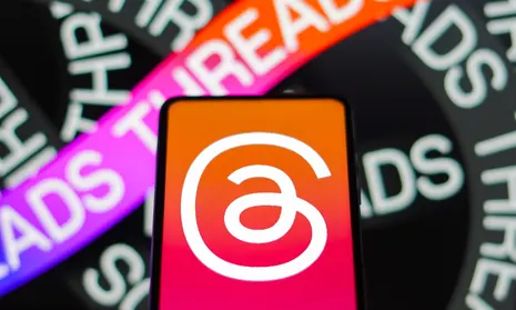
Meta recently unveiled its new social media platform Threads to compete with Twitter. Threads allows users to share short posts, photos and videos, much like Twitter. While the features of Threads seem poised to challenge Twitter, Thread’s unusual new logo has become the center of attention and controversy.
Designed by the Instagram team led by Jez Burrows, the Threads app icon looks like an ‘@’ symbol but appears to be modeled after Instagram’s own logo. The design has elicited mixed reactions from users. While some found it resembles an ear, others were reminded of Tamil, Malayalam alphabets and the letter ‘G’.
What do Users Think About The Threads Logo?
Some users expressed how poorly designed the Threads logo is, comparing it to Twitter’s iconic Golden Spiral logo. Others joked that it looks like a mosquito coil.

The haphazard design and resemblance to various shapes and symbols highlight the lack of thought that went into crafting an original and impactful logo for Threads.
Logos are highly symbolic and important in establishing a brand’s identity. However, Thread’s logo lacks visual appeal, calling into question the app’s potential for longevity and mainstream adoption.
While the logo is mediocre it certainly is memorable because we have never seen anything like it. Even though the design is unusual and left a lot of users puzzled, the very eccentricity of the logo could work to Thread’s advantage by creating buzz and brand recall. Though Logos contribute greatly to a brand’s first impression, a platform’s ultimate success depends on the experience it provides to users. If Threads offers an engaging and unique user experience, impressions of its logo may become more positive over time as people associate it with the brand.
Threads controversial logo seems poised to generate discussion and raise brand awareness, which could benefit the new platform if it delivers on its promise of connecting users. Though the logo is flawed, it will remain to be seen whether it hinders mainstream adoption of Threads or merely adds to its notoriety. For Threads to truly compete with Twitter, Meta must ensure the platform itself, not just its logo, proves meaningful to users.
Read more:
- Best Before Opens New Centurion Store, Challenging Pick n Pay and Checkers with Low Prices
- Local Shops Outpaced Supermarkets as Consumers Flocked to Spazas and Taverns
- Mirinda Welcomes Red Apple and Raspberry to the Family
- Kroger to close dozens of unprofitable stores in strategic restructuring
- Vendors defy ban on second-hand goods as government pushes formalization


Interesting read
Thank you for reading!
Pingback: Threads is Dying - Daily Brand
thanks for info