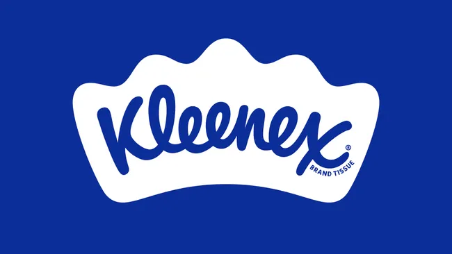
As Kleenex, the world-renowned facial tissue brand, marks its centenary, it has unveiled a new global identity crafted by the design agency Turner Duckworth. This comprehensive rebrand aims to bring a sense of consistency to the Kleenex brand across all regions while imbuing it with a distinct personality that highlights its role in life’s “unexpected moments” – from comforting tearful farewells to soothing seasonal allergies.
Over the years, Kleenex had developed an inconsistent visual identity, with varying logos and color schemes across different markets. Even the iconic Kleenex wordmark had taken on many forms since its inception in 1924, most notably Saul Bass’ 1961 version. The challenge for Turner Duckworth was to create a unified logo and a meaningful, distinctive shape that would ensure legibility and brand recognition in all contexts.

At the heart of the new identity is a crown-shaped icon that ergonomically frames the classic Kleenex script. This crown, subtly reminiscent of a folded tissue, has evolved from a minor detail into a central design element. Metaphorically, it reinforces both Kleenex’s leadership in the category and its core brand idea of being there for us when we need it most.
The comfy curves of both the script and the new crown-shaped icon have influenced the broader look and feel of the rebrand, particularly in the typography and illustration. “Every aspect of the new identity reinforces the brand’s leadership in the category,” says Andy Baron, executive creative director at Turner Duckworth. “It’s about delivering strength in everyday moments while staying true to Kleenex’s heritage.”

To create consistency across all touchpoints, the rebrand standardizes the signature Kleenex Blue as the primary color, solidifying the brand’s visual presence and building equity. Additionally, the refresh introduces a custom typeface, Kleenex Serif, developed in collaboration with type designers Alec Tear and Lewis Macdonald. Drawing from the nuances of the original script, the new font conveys the brand’s strength and adaptability.
Balancing Kleenex’s rich history with contemporary appeal was a key challenge. The updated logo and color palette are complemented by whimsical illustrations that depict moments where Kleenex plays a role, from joyful tears to soothing cold symptoms. Created by Turner Duckworth’s in-house team, these illustrations incorporate the soft curves of the crown, adding warmth and personality to the identity.

The new visual elements are brought to life with gentle animations, while wider campaigns feature lines such as “There’s a Kleenex for every situation” and “Every season, every reason.” The tone acknowledges life’s pivotal moments, giving the brand an approachable and memorable feel.
“This rebrand represents a pivotal moment for Kleenex,” explains Jennifer Kasmarick from Kimberly-Clark. “It’s not just about celebrating the past; it’s about deepening the emotional connection with consumers as we look to the future.” The new visual identity for Kleenex is currently rolling out in North America, with global adoption expected in the coming months, aiming to “reinforce its status as the trusted leader in facial tissues worldwide.”
Read more:
- Best Before Opens New Centurion Store, Challenging Pick n Pay and Checkers with Low Prices
- Local Shops Outpaced Supermarkets as Consumers Flocked to Spazas and Taverns
- Mirinda Welcomes Red Apple and Raspberry to the Family
- Kroger to close dozens of unprofitable stores in strategic restructuring
- Vendors defy ban on second-hand goods as government pushes formalization


