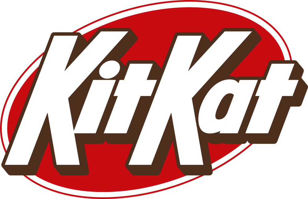
Kit Kat is getting a royal makeover. The iconic candy bar sold by Hershey in the United States has received a modernized logo design meant to better represent the brand. Gone are the curved letters and inner shadows, replaced by straight, bold typography set against a simple oval shape.

The new logo was created by Sterling Brands, the agency responsible for food branding projects from companies like Welch’s and Nestlé. They aimed to capture Kit Kat’s essence through the design. As Sterling stated, the updated look is meant to “celebrate the crispy, creamy taste of Kit Kat, activating the brand with the upbeat, kinetic energy of Kit Kat’s iconic ‘break’.”

While Kit Kat is produced globally by Nestlé, Hershey owns the brand in America. They unveiled the refreshed packaging design earlier this year. Though subtle, the changes have a notable effect. The blocky logo typefaces stand out more prominently against a neutral backdrop. There is also a dark outline surrounding the lettering which gives it a stylized, retro feel.
The rebrand comes as Hershey seeks to reignite growth in the confectionary category. On earnings calls, CEO Michele Buck acknowledged consumers pulling back on discretionary purchases. However, the company has seen success expanding offerings in candy and salty snacks. Coming attractions include a new Jolly Rancher gummy product and an oversized Shaq-a-licious gummy endorsed by basketball legend Shaquille O’Neal.
Read more:
- Best Before Opens New Centurion Store, Challenging Pick n Pay and Checkers with Low Prices
- Local Shops Outpaced Supermarkets as Consumers Flocked to Spazas and Taverns
- Mirinda Welcomes Red Apple and Raspberry to the Family
- Kroger to close dozens of unprofitable stores in strategic restructuring
- Vendors defy ban on second-hand goods as government pushes formalization


