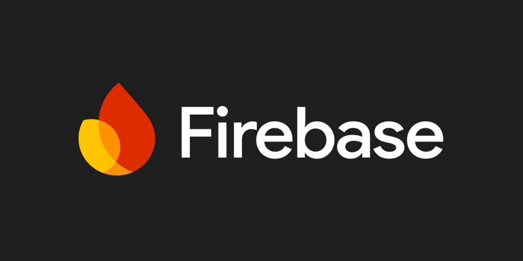
In a bold move that underscores its commitment to innovation and reliability, firebase has unveiled a striking new logo that blends modern aesthetics with a sense of stability. This refreshed visual identity not only captures the essence of the platform’s dynamic spirit but also signals a renewed dedication to being a trusted partner in the digital landscape. The new logo, featuring a vibrant and abstract fire emblem, is poised to make a lasting impression and resonate deeply with users and stakeholders alike.
The revamped logo features an abstract depiction of a fire, now enriched with a gradient that transitions from lighter orange to amber and yellow hues. This dynamic color palette not only enhances the visual appeal but also symbolizes energy and innovation, aligning perfectly with the platform’s core values.
The inscription accompanying the emblem remains unchanged in its fundamental design, yet subtle modifications have been made to enhance its visual impact. The strokes of the lettering have been thickened slightly, resulting in a more robust and assertive appearance. Additionally, the gray color of the wordmark has been darkened, creating a harmonious balance with the vivid colors of the emblem to its left. The overall effect is a logo that is not only more recognizable but also exudes a stronger, more powerful presence.
The choice of font for the logo has been carefully considered to convey professionalism and reliability. The platform continues to utilize a simple, sans-serif typeface that closely resembles Google Sans Medium or Pulp Display Regular. In the updated logo, the font has been rendered in a bolder style, further reinforcing the image of a dependable and professional platform.
One of the most notable changes in the new logo is the adoption of a dark gray color for the wordmark, replacing the traditional black. This conservative yet neutral color choice serves multiple purposes. It balances the bright yellow emblem, preventing it from overwhelming the overall design, and it also imparts a sense of stability and control. The dark gray hue complements the vivid emblem, ensuring that the entire logo maintains a cohesive and visually appealing look.
The emblem itself, with its vibrant yellow and amber shades, is designed to inspire and energize. Yellow is often associated with creativity and innovation, and in this context, it encourages developers to push the boundaries and create something truly remarkable. The introduction of the amber shade of orange adds depth and warmth to the design, bringing in the powerful qualities of red without being overly intense.
The result of these design changes is a logo that is both visually striking and symbolically rich. It underscores the platform’s commitment to being a stable and reliable partner while also highlighting its innovative and dynamic nature. The updated logo successfully combines boldness with professionalism, creating a visual identity that is sure to resonate with users and stakeholders alike. As the platform continues to grow and evolve, its new logo will undoubtedly serve as a powerful representation of its values and aspirations.
Source: 1000logos
Read more:
- Best Before Opens New Centurion Store, Challenging Pick n Pay and Checkers with Low Prices
- Local Shops Outpaced Supermarkets as Consumers Flocked to Spazas and Taverns
- Mirinda Welcomes Red Apple and Raspberry to the Family
- Kroger to close dozens of unprofitable stores in strategic restructuring
- Vendors defy ban on second-hand goods as government pushes formalization


