In the fast-paced world of fast food, branding plays a vital role in attracting customers and creating a lasting impression. In Zimbabwe’s fast food scene, the default branding strategy seems to be riffing off the tried-and-true red and yellow color palette made famous by category titans like Chicken Inn. Walk along any street in Harare and you’ll likely spot a dozen eateries featuring some variation of this formulaic crimson and gold aesthetic.
While this derivative approach may stem from red and yellow’s strong association with beloved national chains, it also shows a lack of originality. Relying solely on this chromatic code risks being perceived as repetitive or uninspired.
Refreshingly, Bakers Inn has bucked the pervasive red-and-yellow trend as its offerings expand beyond baked goods into hot meals. Despite ownership links to Chicken Inn under parent company Simbisa, Bakers Inn remains committed to its distinctive blue and white visual identity. This demonstrates admirable branding integrity even as many fast food newcomers opt for copycat aesthetics piggybacking on established players.

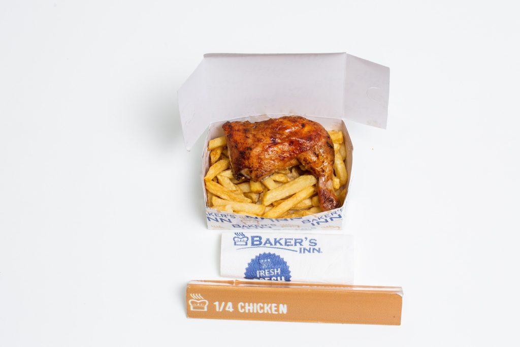
Owned by Simbisa Brands, a subsidiary of the Innscor Africa group, Bakers Inn has long been associated with its iconic blue and white color palette. Originally known for its delicious bread offerings, the company decided to expand its menu to include a wide array of fast food options, such as pies, hot dogs, burgers, and the now-famous quarter chicken and chips combo.
When introducing the Bakers Inn quarter chicken and chips, many expected the company to adopt the widely recognized red and yellow scheme from their sister brand, Chicken Inn. However, Bakers Inn surprised everyone by sticking to their original blue and white colors.
This decision showcases the forward-thinking and innovative nature of Bakers Inn. While other companies might have opted to adopt the red and yellow scheme to ride on the familiarity and success of their sister brand, Bakers Inn chose to be different. By maintaining their unique color palette, they have demonstrated a commitment to their brand’s individuality and the importance of creating a distinct identity in the market.
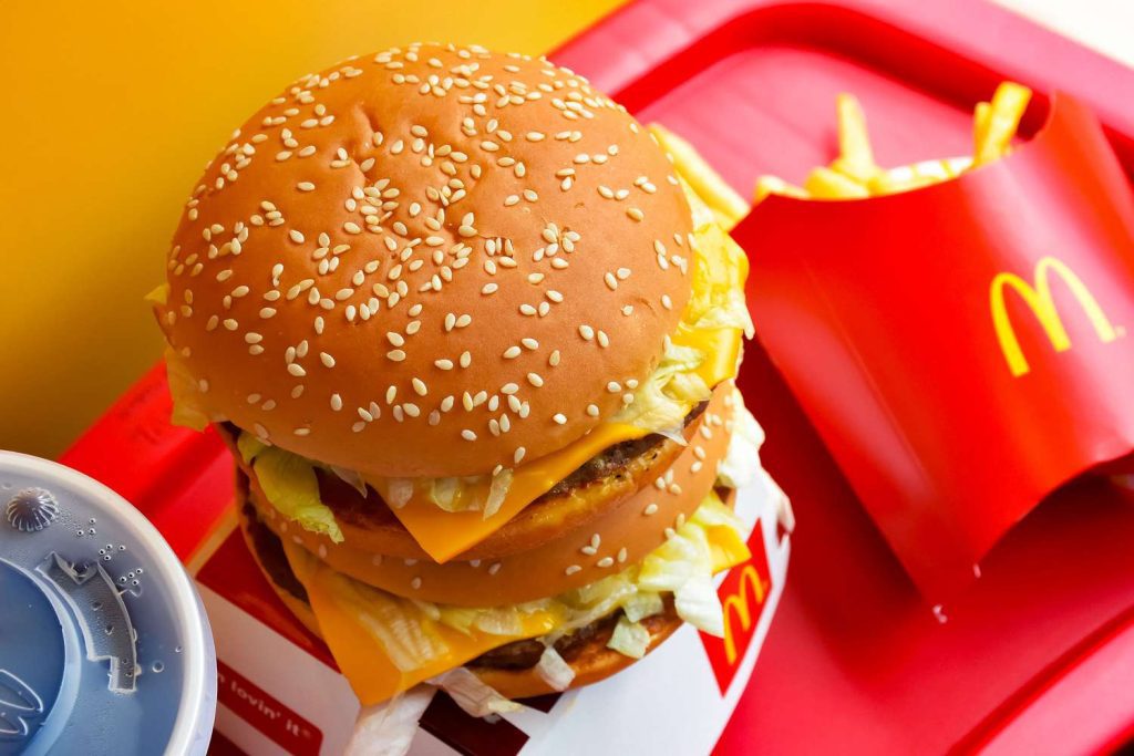
The fast food industry has long relied on the psychological impact of colors to influence consumer behavior. Red and yellow are known to stimulate appetite, grab attention, and create a sense of urgency. These colors have been successfully utilized by numerous fast food giants worldwide (McDonalds, KFC etc), becoming synonymous with the industry itself. However, Bakers Inn’s decision to break away from this established norm is a breath of fresh air.
By staying true to their original color scheme, Bakers Inn has managed to create a strong brand presence that stands out amidst a sea of red and yellow. Their blue and white branding allows them to differentiate themselves from the competition and attract customers looking for a unique and refreshing fast food experience.
Simbisa Brands, the holding company behind Bakers Inn, has a vast presence in the Quick Service Restaurant (QSR) industry, operating over 640 restaurants in nine African countries. With this extensive reach, Bakers Inn’s innovative approach to branding serves as an inspiration to other fast food chains that you can dump red and yellow and still be successful. It emphasizes the importance of embracing individuality and staying true to one’s unique brand identity, even in a saturated market.
Bakers Inn’s decision to defy industry standards and maintain its original color scheme is a testament to their innovativeness and commitment to brand identity. By staying true to their blue and white branding, they have managed to create a distinct presence in the fast food landscape of Zimbabwe. Their bold move serves as a reminder to other companies of the power of standing out from the crowd and embracing individuality. Bakers Inn has certainly set the stage for innovation in fast food branding, leaving a lasting impression on both their customers and industry peers alike.
Read more:
- Vendors defy ban on second-hand goods as government pushes formalization

- Pick n Pay eyes Zimbabwean retail revival with strategic expansion and Bulawayo mega-mall
- Seattle Reign FC unveils a bold new identity
- Chery Bets big on South Africa with stylish new hybrid SUVs
- Shutdown of Food Lovers market stores signals deeper crisis at OK Zimbabwe