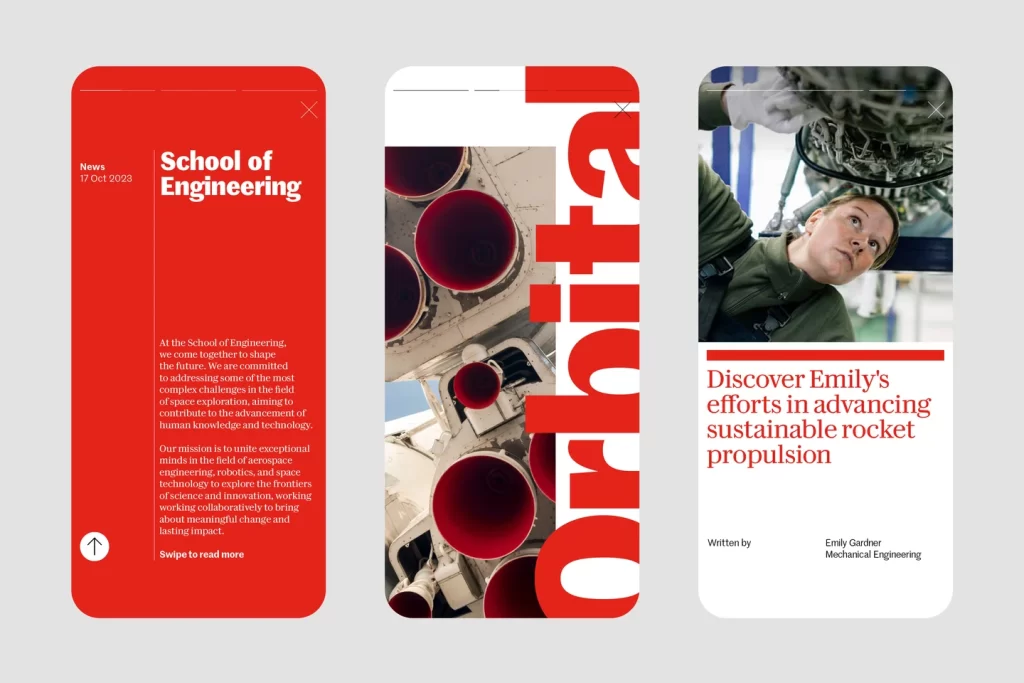
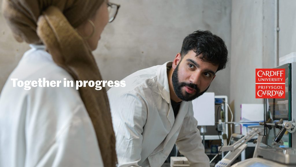
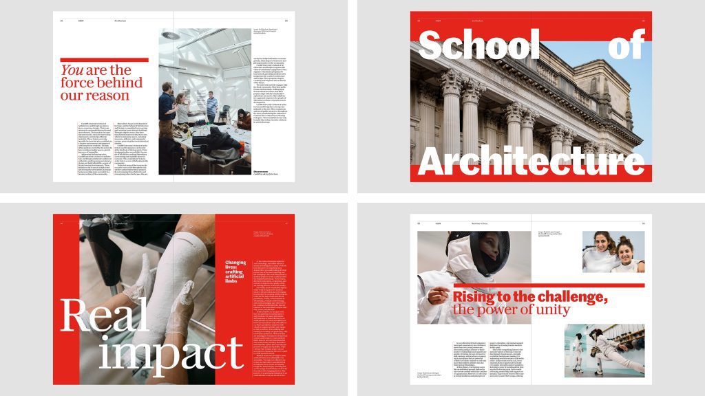
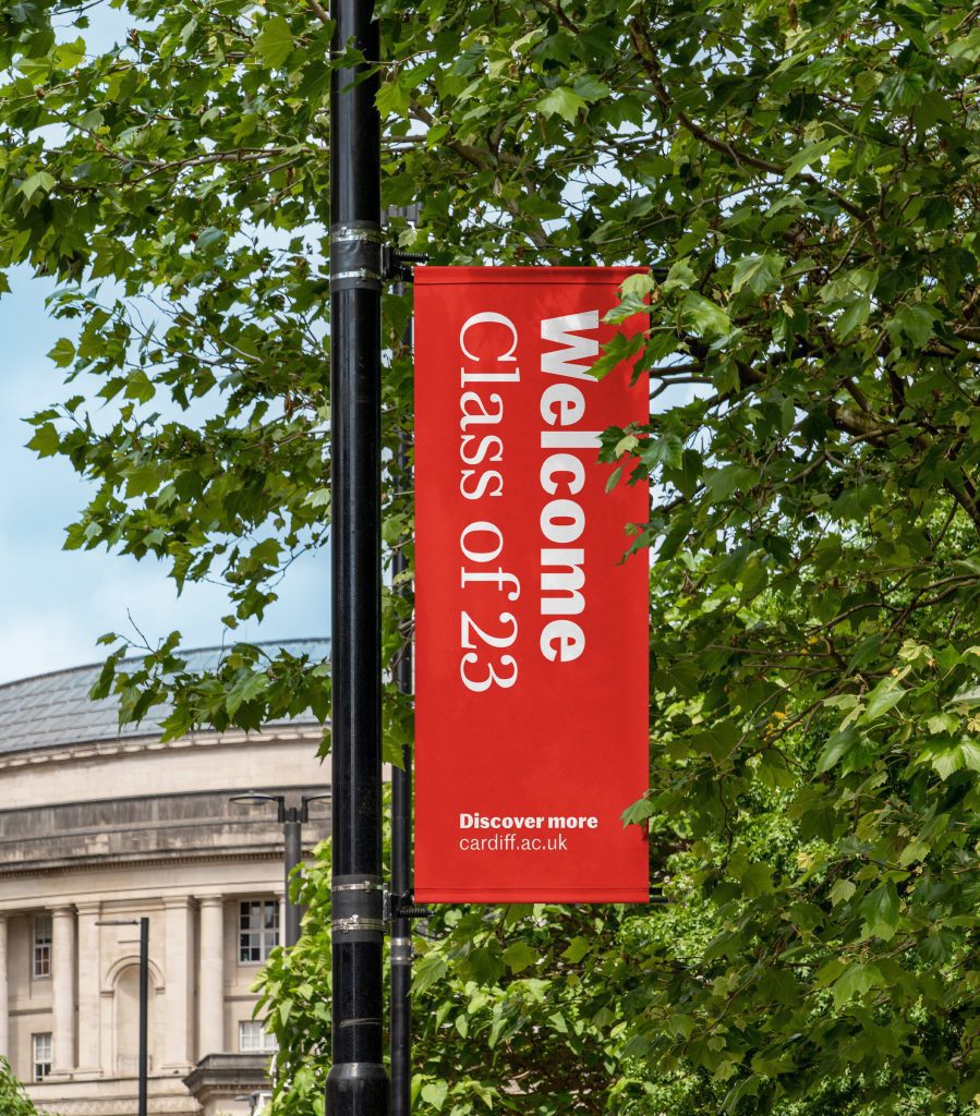
The University of Cardiff has undergone a transformative rebranding process, courtesy of the Manchester design studio Only.
Those familiar with the university will recognize its commitment to the Welsh Language Standards, which dictate that any publicly displayed text in Wales must be translated into Welsh and that Welsh should be treated on equal footing with English.
This rebranding effort presents an intriguing case of a dual language identity, where achieving balance between the two languages is not just a preference but a requirement within our industry.
Only collaborated closely with Commercial Type, Paul Barnes (the original typeface designer), and the Welsh language board at the University, who provided guidance on development and readability.

For the project, two typefaces were selected: Marr Sans and Darby Serif, representing the English and Welsh languages respectively.
Additionally, Only expanded each typeface to include custom digraphs, which combine two letters to form a single sound. In Welsh, there are eight instances where symbols merge to create unique letters, such as “Ll.”

Matthew Tweddle, co-founder and Creative Director of Only, explains, “Welsh has historically utilized the same graphemes as English, printed from the same presses. Unlike other languages like Irish, there isn’t a tradition in Wales of employing a distinct writing style. However, there are distinctive qualities to the language that we wanted to celebrate.”
Embracing this heritage, however, is not without challenges, particularly when relying on historical references. For instance, a design studio creating a Welsh brand face might unintentionally and inaccurately depict the language as archaic by resorting to medieval examples. Thus, Only consciously avoided such historical associations.


The overall visual language of the rebranding is simple and adaptable, drawing subtle inspiration from the concept of collective action.
Only sought inspiration from Wales’s rich history of socialist and labor movements, carefully avoiding any implicit political bias in their work. The refreshed red color palette and clean typography exemplify this reference in action.
Only’s collaboration with the University of Cardiff resulted in a compelling rebranding effort that adheres to the Welsh Language Standards.
By carefully balancing the use of English and Welsh, incorporating custom digraphs, and drawing inspiration from Wales’s history without imposing political bias, Only has achieved a harmonious and inclusive visual identity for the university.
Read more:
- Uniqode’s bold rebrand by Studio Koto
- Diana’s Seafood Rebrand: A Fresh Catch with a Social Media Buzz
- Reel in the sales :Toffifee’s night promotion
- Megaplex Rebrands: A Bold New Era of Entertainment Begins
- Ditch the Drab, Grab a Smoothie: Yanaya is Revolutionizing Events with a Burst of Flavor and Energy


