By Melody Korongwe
Uniqode’s recent rebrand, masterfully executed by Studiokoto, exemplifies this principle.
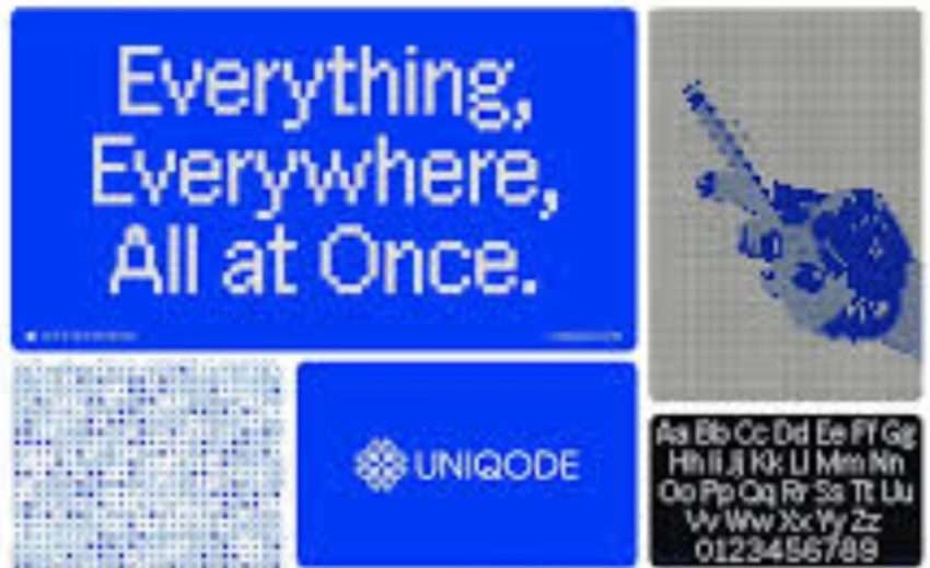
Formerly known as Beaconstac, Uniqode has emerged with a fresh identity that reflects its mission to “Map Every Move” by seamlessly bridging the physical and digital worlds through advanced QR code technology.
One of the most distinctive aspects of Uniqode’s rebrand is the concept of “stitching.” Studiokoto centered the rebrand around this metaphor, symbolizing the connection between physical and digital experiences.
This idea is visually represented throughout the brand’s identity, with a logo and design system that incorporate elements of cross-stitching.
Furthermore, this concept has been widely praised on social media, with many users appreciating the unique and creative approach.
“The stitching concept is brilliant! It’s such a clever way to visualize the connection between IRL and URL,” one LinkedIn user commented.
Building on the stitching metaphor, the rebrand features a distinctive visual language. A custom typeface, Uniqode Sans, has been developed to complement the new identity.
Additionally, the color palette evokes both digital and tactile qualities, reinforcing the seamless blend between the physical and digital realms.
Moreover, the use of cross-stitch imagery throughout the branding has been noted as particularly unique.
“The visual language is so distinct! It’s unlike anything I’ve seen in the tech space,” a Twitter user remarked.
Since its unveiling, the rebrand has generated significant engagement across social media platforms. Users have overwhelmingly praised @studiokoto for its innovative approach, with many expressing that the branding makes the technology feel more human.
However, while the majority of feedback has been positive, some users have questioned the choice of cross-stitching imagery for a tech company. Despite this, the overall reception has been favorable, with discussions centering on the evolving role of QR codes and the necessity of seamless digital-physical integration.
“This rebrand is a game-changer! It really elevates the perception of QR code technology,” an Instagram user stated. These conversations further demonstrate the impact of Uniqode’s bold rebranding strategy.
The Uniqode rebrand offers valuable insights into the power of thoughtful design in shaping a brand’s perception.
As the digital landscape continues evolving, Uniqode’s rebrand is an inspiring example of how brands can innovate and remain relevant in an ever-changing market.
Melody Korongwe is a driven and ambitious journalist with a strong passion for storytelling. She holds a Bachelor’s Degree in Journalism, Media, and Broadcasting from the University of Zimbabwe, she has a solid foundation in newswriting and media principles. With a keen interest in contributing to the media industry, Melody is dedicated to leveraging her writing skills to produce high-quality content. She can be reached at melodykorongwe4@gmail.com or +263 786 640 520
- Best Before Opens New Centurion Store, Challenging Pick n Pay and Checkers with Low Prices

- Local Shops Outpaced Supermarkets as Consumers Flocked to Spazas and Taverns
- Mirinda Welcomes Red Apple and Raspberry to the Family
- Kroger to close dozens of unprofitable stores in strategic restructuring
- Vendors defy ban on second-hand goods as government pushes formalization