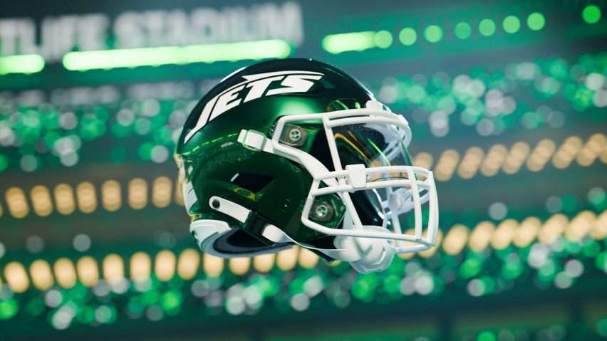
After years of middling results, the New York Jets are soaring once again – but this time off the field with a branding makeover that taps into the franchise’s golden age. With a revved-up logo, uniforms, and design aesthetic pulling straight from the 1980s, the Jets are banking that a dose of nostalgia will fuel a new era of success.
That glorious decade saw the team ascend to elite status on the wings of legends like Mark Gastineau and Joe Klecko – defenders who made up the legendary “New York Sack Exchange.” Together they terrified quarterbacks and led the Jets to unprecedented heights, becoming symbols of the electric energy of those “Gang Green” teams and all they represented in the hard-nosed, workmanlike identity of New York sports.
Now the Jets aim to restore some of that magic with creative that celebrates their storied past while staking a claim to future glory. Can a branding blitz of “retro cool” help jettison this longtime flightless franchise back into true championship contention?

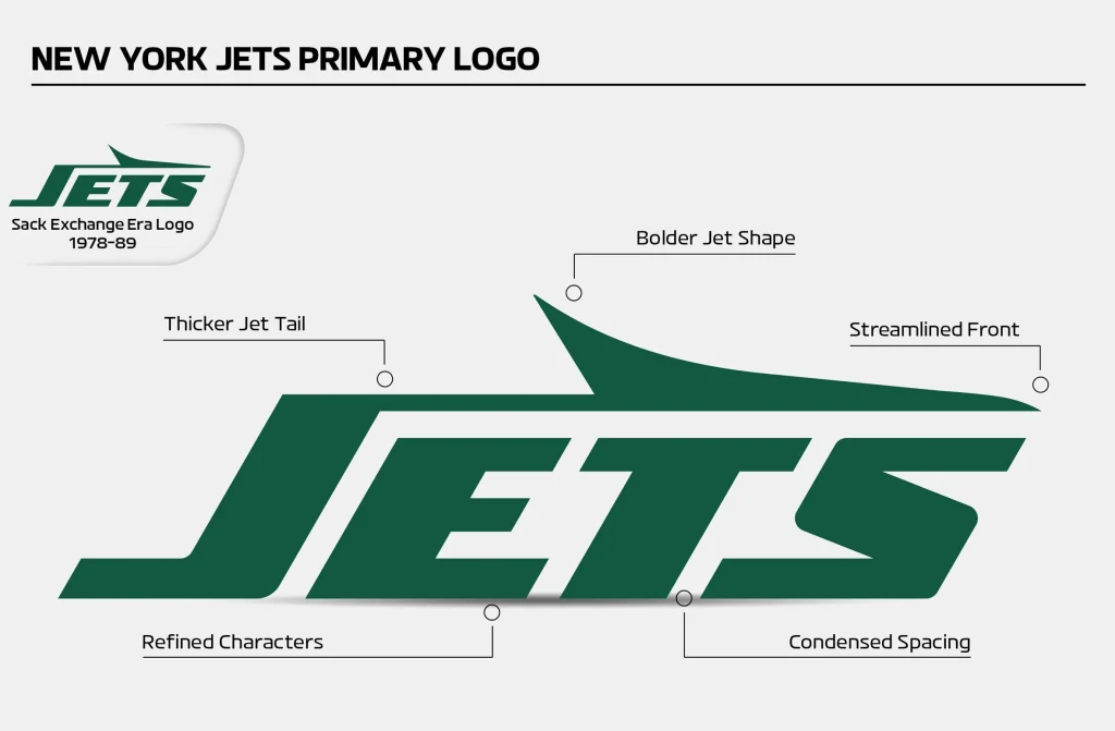
The refreshed logo takes inspiration from the original designed by Jim Pons, the team’s former video director and bass guitarist for Frank Zappa’s band. Used from 1978 to 1997, Pons’s hand-drawn logo became synonymous with the championship-caliber “New York Sack Exchange” teams of that era.
According to Jets VP of Fan Commerce Chris Pierce, restoring the classic jet logo was spurred by persistent fan campaigning. “Over the past few seasons, it became abundantly clear that supporters wanted to return to a logo they strongly identify with from the teams they cheered for in their formative years,” says Pierce. Social media responses made it clear reintroducing the jet would satisfy longtime followers.
The spacing between the letters has been adjusted to be more consistent, while the tail of the J is taller and thicker and the jet itself is more pointed. “We put that logo under the microscope and asked is this perfect for applications that exist in 2024 that did not exist in 1978,” explained Pierce.
While modernizing the look, the updated logo still channels the past. The jet aircraft is drawn in a more angular, pointed style with a bolder italicized form to imply speed and movement forward. Even the uniform striping down the sleeve and leg replicates the iconic vertical look of the 1980s uniforms that instilled fear in opposing offenses.
Pierce notes bringing back the jet further strengthens the team’s identity by reinforcing their literal name connected to the nearby LaGuardia Airport. “Especially for new or more casual fans, visually representing our aviation roots helps them understand why we’re called the Jets,” says Pierce.
In addition to the new logo, the Jets unveiled a “Legacy Collection” of green, white, and black uniforms inspired by the original Sack Exchange designs. Just like their predecessors, these modern jerseys will have double-striped sleeves and single-striped legs to honor the legendary defense that struck fear into quarterbacks for nearly a decade.
Blending nods to the past with contemporary flair, the complete Jets rebrand resurrects the iconic jet aircraft logo and classic uniform aesthetics from their most dominant era to re-establish team pride and legacy as they pursue future championships.
Source: Dezeen
Read more:
- Best Before Opens New Centurion Store, Challenging Pick n Pay and Checkers with Low Prices
- Local Shops Outpaced Supermarkets as Consumers Flocked to Spazas and Taverns
- Mirinda Welcomes Red Apple and Raspberry to the Family
- Kroger to close dozens of unprofitable stores in strategic restructuring
- Vendors defy ban on second-hand goods as government pushes formalization


