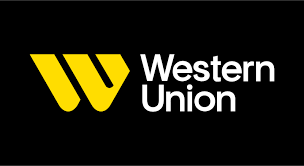
Western Union, one of the most recognizable names in the global payments industry, has recently undergone a major rebranding effort.
The company’s new logo and visual identity were handled by Love Street and Company, a creative agency based in Los Angeles California.
The new logo features a monogram that is designed to feel like calligraphic strokes with multidirectional angles representing movement in a universal way.
The new Western Union logo is a departure from the company’s previous branding, which featured a more traditional, serif font and a simple, circular emblem.
The new logo is more modern and dynamic, with a bold, sans-serif font and an abstract monogram that is both eye-catching and memorable.
The monogram is designed to represent movement and connectivity, with its multidirectional angles suggesting the idea of a network of connections that spans the globe.
According to Darrin Crescenzi, one of the designers of the new logo, one of the biggest priorities for the rebranding effort was to bridge the gap between current and future services and the vast network of physical experiences across the globe.

Darrin Crescenzi one of the designers of the New Western Union Logo
The new symbol is designed to be as powerful as an app icon or brick and mortar signage, with its bold, modern design and universal appeal.
The new symbol on the Western Union logo is colored in the company’s signature yellow, which is a bright and bold shade that is instantly recognizable.
The new logo and visual identity for Western Union are part of a broader effort to reposition the company for the future.
As digital payments become more common and traditional banking services are disrupted by new technologies, Western Union is working to stay ahead of the curve and remain relevant to consumers around the world.
One of the ways that the company is doing this is by expanding its digital offerings.
In recent years, Western Union has invested heavily in its mobile app and online platform, making it easier than ever for customers to send and receive money from anywhere in the world.
The new logo and visual identity are designed to reflect this digital focus, with a modern and dynamic design that is more in line with the expectations of today’s consumers.
Another way that Western Union is staying relevant is by expanding its reach into new markets.
The company has a vast network of physical locations around the world, with more than 500,000 agent locations in more than 200 countries and territories.
This makes it one of the largest and most widely recognized brands in the global payments industry.
With its new logo and visual identity, Western Union is positioning itself as a brand that is ready for the future.
The company has a strong legacy and a reputation for reliability and trust, but it is also embracing change and innovation in order to stay ahead of the curve.
Read more:
- Sam’s Club reshapes retail landscape with storewide digital transformation
- Target goes green, challenges Walmart with innovative paper wine bottles
- CAG Travellers: Weaving journeys of trust and luxury across Zimbabwe
- Zimbabwe’s Fastjet Operates Inaugural Flight
- TN Cybertech Bank: A Risky Rebrand for Steward Bank Zimbabwe?


