Skip to content

Daily Brand

Branding for the now

Menu
  • Home
  • Learn
    • Case Studies
    • ESG
    • How To
  • News
    • Artificial Intelligence
    • Rebrands
    • Startups
  • Regions
    • Africa
    • America
    • Australia
    • Asia
    • Europe
    • South Africa
    • UK
    • Zimbabwe
  • Ad Formats
    • Billboards
    • Experiential Ads
    • Online Ads
    • Posters
    • Print Ads
    • Video Commercials
  • Creativity
    • Campaigns
    • Funny Ads
    • Personalities
  • Studies
  • Guests
    • Ruvimbo Jeche
  • Resources
    • Free PDFs
  • Agencies
  • Opinions
Menu
spotify

Spotify Introduces a New Custom Typeface: Spotify Mix

Posted on

Spotify, the prominent music streaming service, has unveiled a new custom typeface named Spotify Mix, designed to enhance the platform’s visual dynamism. This innovative typeface, a fusion of various font styles, line weights, and unique details, marks a significant shift in Spotify’s branding strategy.

The development of Spotify Mix was a collaborative effort with Berlin-based foundry Dinamo Typefaces and spanned over eighteen months. Spotify intends to implement this new typeface across multiple facets of its platform in the forthcoming months. This rollout will include updates to the company’s wordmark, the integration of the font into both the app and web player, and the introduction of new marketing materials.

Previously, Spotify utilized a typeface called Circular, which was not exclusive to the brand. According to Rasmus Wängelin, Spotify’s global head of brand design, Circular’s design constraints limited its ability to convey a wide spectrum of moods and emotions, thereby necessitating the creation of a bespoke typeface.

“We built a lot of equity [with Circular], and it works really well inside of the app,” Wängelin stated. “But at the same time, it has been limiting for us when it comes to expression. We work with so many different audiences—creators on our platform, our users, our advertisers—so it’s important that we show up in authentic ways in different spaces.”

In pursuit of a versatile and distinctive font, Wängelin’s team, alongside Dinamo’s designers, conducted an extensive study of typefaces within the music industry. They examined music posters, album covers, and promotional materials spanning various genres. The diversity of styles they encountered led them to the conclusion that a singular font could not adequately capture the desired essence. Consequently, they amalgamated elements from different typographic traditions. For instance, the upper and lowercase S are inspired by traditional humanist letterforms, while the J and K align more closely with the angular grotesque style.

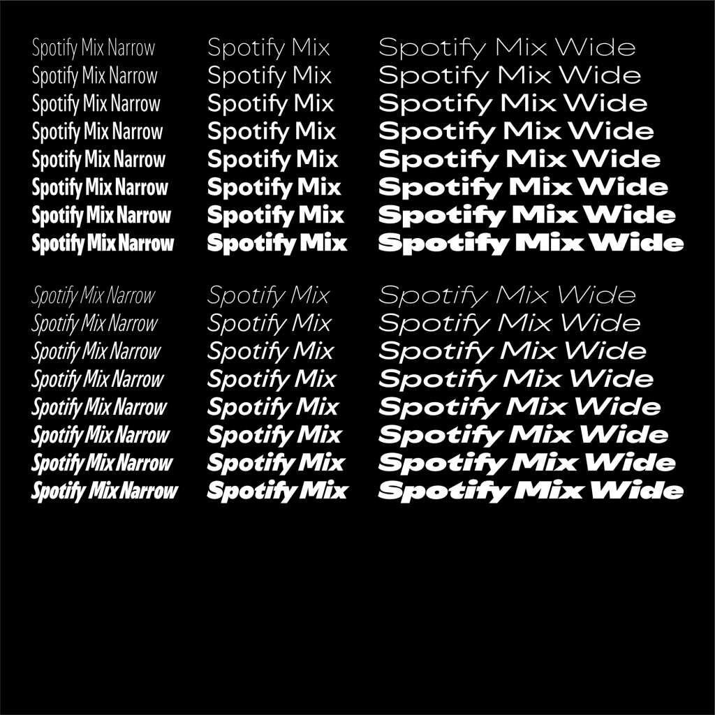
Spotify Mix also defies several conventional typographic norms. The letter t features a swooping line connecting from right to left, intended to mimic an audio wave. In letters such as a, d, and e, where the negative space would typically be circular, Spotify Mix employs a sideways teardrop shape, evoking audio amplification. These meticulous details are designed to infuse the text with a sense of flow and rhythm, akin to the music it represents. The typeface is designed to be highly adaptable—capable of being condensed, bold, italicized, and stretched to fit a variety of genres and aesthetics.

In a marketing landscape where font trends shift rapidly, creating a distinctive and enduring typeface presents significant challenges. Wängelin asserts that the key to longevity is “avoiding trends at all costs.”

“[A successful font] needs to have two things: functionality and emotion,” he elaborated. “You can create a typeface that is super functional and extremely readable, but it’s just not that nice to look at. Or you can go very wild and create a typeface that is really out there, but then when you start putting it inside of the app, it just doesn’t work—it’s hard to read. When you manage to find that intersection of emotion and function, that’s when you’re successful with this type of work.”

With Spotify Mix, the company aspires to achieve this delicate balance, providing a unique visual identity that resonates across all user interactions, from app interfaces to marketing campaigns. As the new typeface is progressively rolled out, users can anticipate a refreshed and dynamic design that encapsulates Spotify’s innovative and expressive spirit.

Source: Fast Company

Read more:

  • Percent Rebrand: A bold visual shift sparks online buzz
  • Zimpapers launches Media Training Institute
  • Nike after dark tour 2025 to spotlight women’s running across seven global cities
  • Naked paper
    Otherway’s Bold Rebrand for Naked Paper
  • Edgars
    Edgars Launches New Express Stores in Bold Expansion Drive

Leave a Reply Cancel reply

Your email address will not be published. Required fields are marked *

Search

  • Percent Rebrand: A bold visual shift sparks online…
    Rebrands
  • Zimpapers launches Media Training Institute
    News
  • Nike after dark tour 2025 to spotlight women’s run…
    News
  • Naked paperOtherway’s Bold Rebrand for Naked Paper
    News, Rebrands, UK
  • EdgarsEdgars Launches New Express Stores in Bold Expansi…
    News, Zimbabwe
  • Sam’s Club reshapes retail landscape with st…
    America, News
  • Target goes green, challenges Walmart with innovat…
    America, News
  • CAG Travellers: Weaving journeys of trust and luxu…
    News, Uncategorized
  • Zimbabwe’s Fastjet Operates Inaugural Flight
    News
  • tn-cybertech-bankTN Cybertech Bank: A Risky Rebrand for Steward Ban…
    News, Rebrands, Zimbabwe
  • Ingwebu Breweries targets wider market reach with …
    News, Zimbabwe
  • Mountain Dew Unveils Baja Cabo Citrus Flavor for S…
    News
  • The African Finder: A new voice for South Africa&#…
    News
  • Professor-Emmanuel-Ohene Afoakwa-gctuGCTU Vice Chancellor Affirms University’s Le…
    Africa, News
  •  Uniqode’s bold rebrand by Studio Koto
    Rebrands
  • Diana’s Seafood Rebrand: A Fresh Catch with …
    Rebrands
  • Reel in the sales :Toffifee’s night promotio…
    News
  • megaplex-rebrandMegaplex Rebrands: A Bold New Era of Entertainment…
    America, News, Rebrands
  • yanayaYanaya Lifestyle Launches Innovative Smoothie Refu…
    News, Zimbabwe
  • pepsi-poppiPepsi Acquires Poppi, Positions itself in the Well…
    America, News
  • internet search engine, tablet, samsung, galaxy, office, work desk, modern, technology, business, marketing, digital, computer, mobile technologies, work, promotion, electronics, google, web browser, phone, smartphone, google, google, google, google, google`Google Lens , An E-commerce Game Changer.
    America, News
  • 1664-blanc-london-fashion-week1664 Blanc Makes a Statement at London Fashion Wee…
    Campaigns, Europe, News
  • poultry-farmingMarketing Tips for Poultry Farming: Insights from …
    How To, News, Zimbabwe
  • coca-colaCoca-Cola’s Iconic bottle gets a modern make…
    America, News
  • shopriteShoprite bucks Retail Trend in South Africa With A…
    News, South Africa
  • dawtona-rebrandDawtona Rebrands, Introduces New Logo
    Europe, News, Rebrands
  • youtube-rebrand-new-logoYouTube’s Subtle Rebrand, Logo Redesign
    America, News, Rebrands
  • harare-boutiqe-mallHow Clothing Boutique Retailers are Thriving in a …
    News, Zimbabwe
  • zimnat-insuranceZimnat’s Giant Ribbon-Wrapped House Stuns Ha…
    Campaigns, Experiential Ads, News, Zimbabwe
  • nike-superbowl-ad-so-winNike’s Superbowl LIX Ad: “You Can’t Wi…
    America, News, Video Commercials
  • bolt-rebrandBolt Rebrands, Executes a Subtle Brand Refresh
    Europe, News, Rebrands
  • shoprite-malawiMBS Closes down Shoprite stores in Malawi due to P…
    Africa, News
  • OK-Zimbabwe-LimitedOK Zimbabwe Shutdown: How the Closure is Reshaping…
    Africa, News, Zimbabwe
  • oreoIntroducing Oreo Mocha Creme: A Bold New Coffee-In…
    America, News
  • kombi-harareHarare Commuters Slam Kombi Drivers Over Poor Cust…
    Africa, News, Zimbabwe
  • Walmart Rebrand: Walmart’s New Logo Sparks Online …
    America, News, Rebrands
  • customer-satisfactionTailor’s troubles: When customer satisfactio…
    Africa, News, Uncategorized
  • Africa : the missing link to the much needed Use Case for Technological Advances.Africa : The Missing Link to the Much Needed Use C…
    Africa, News, Opinions
  • elton-wordsmithBridging the Knowledge Accumulation Gap in Africa
    Africa, News, Opinions, Regions
  • move-loud-john-coleThe Move Loud Dance Class set to light up Harare
    News, Zimbabwe

Advertise with us

  • Add your Agency
  • Dashboard
  • Find Local Agencies
  • Freelancers
  • Home
    • About
    • db web services
    • Find an Agency
    • Free PDFs
  • Manchester City and WWE Launch Groundbreaking Partnership
  • Privacy Policy
©2025 Daily Brand | Design: Newspaperly WordPress Theme